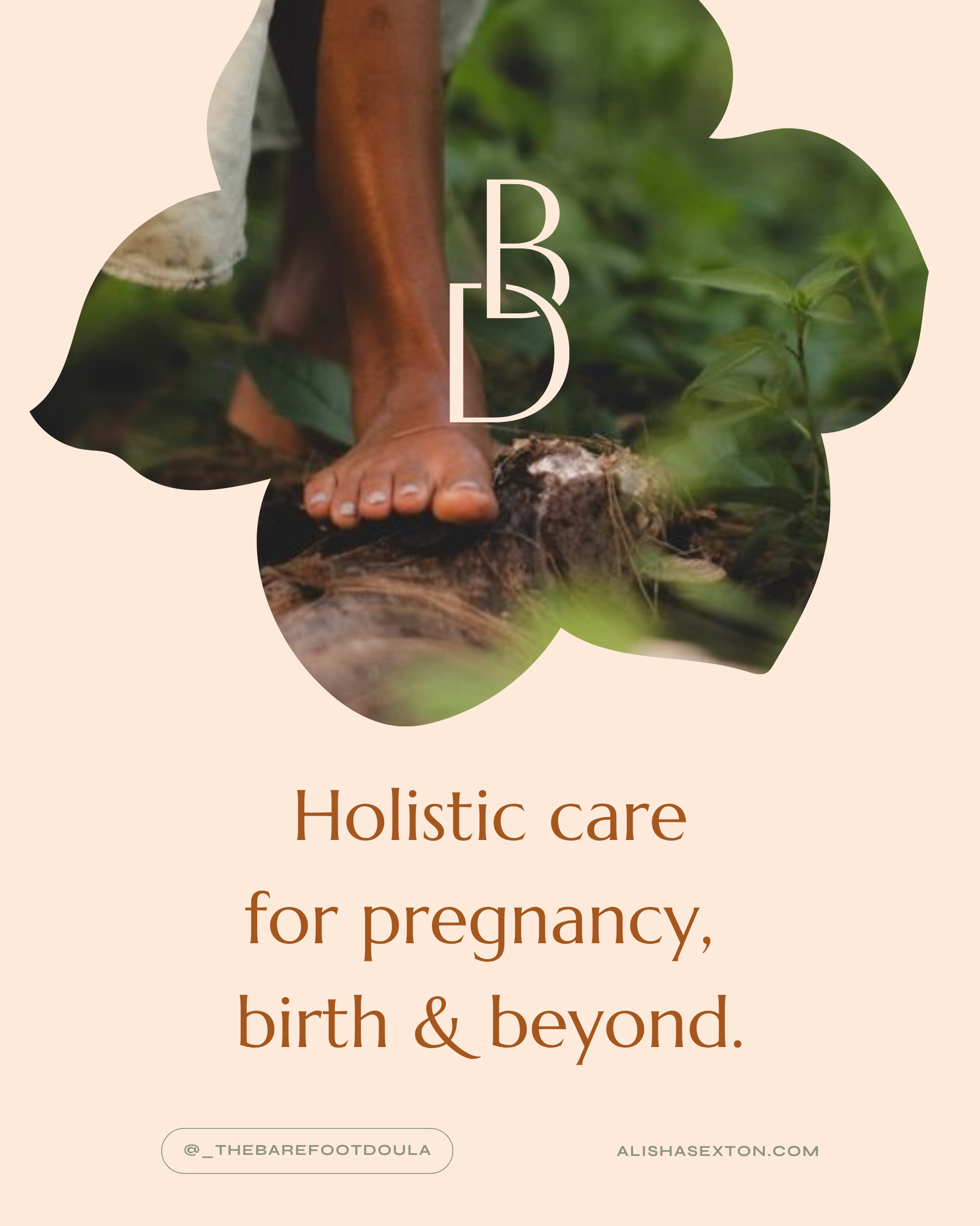
The Barefoot Doula
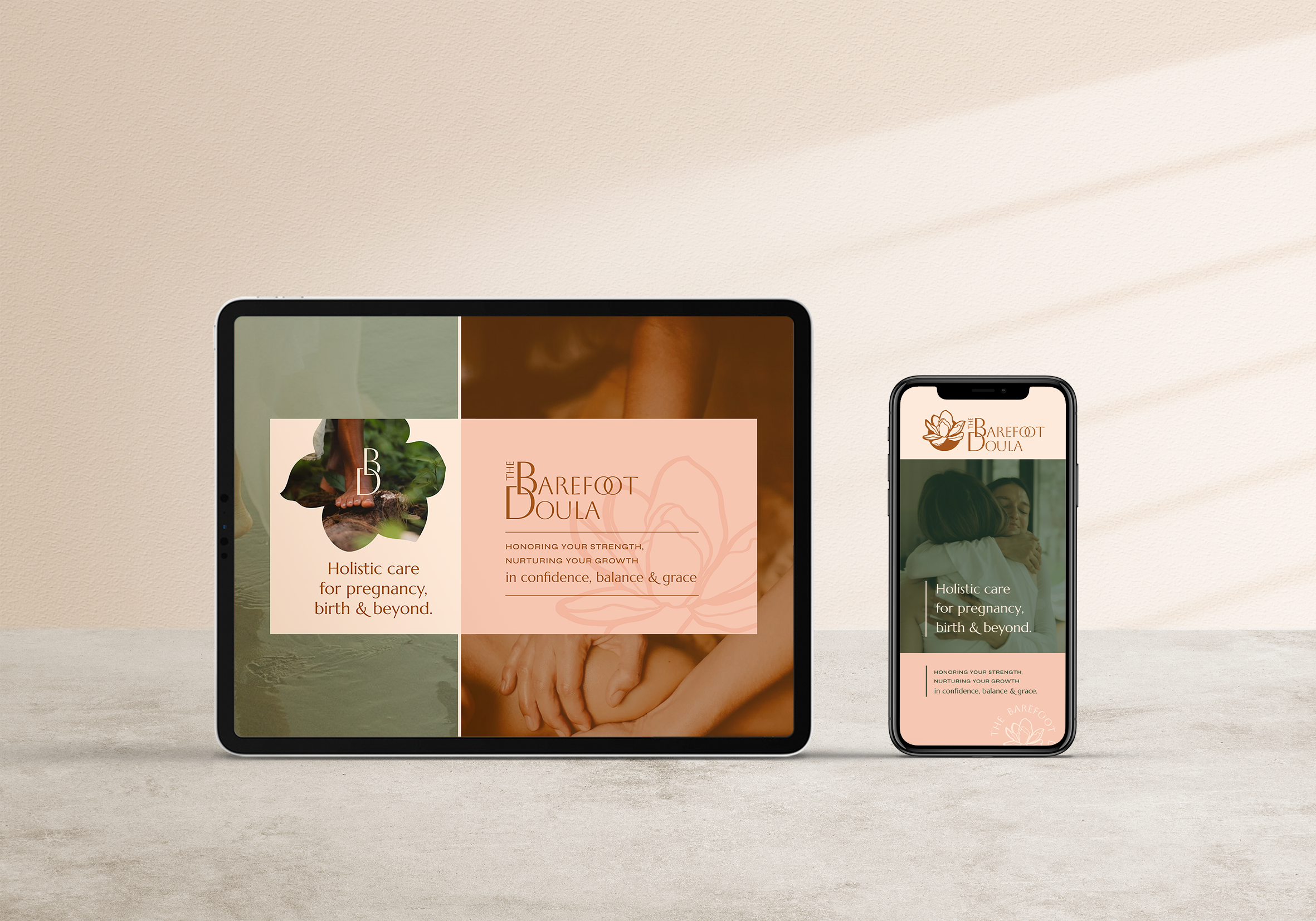
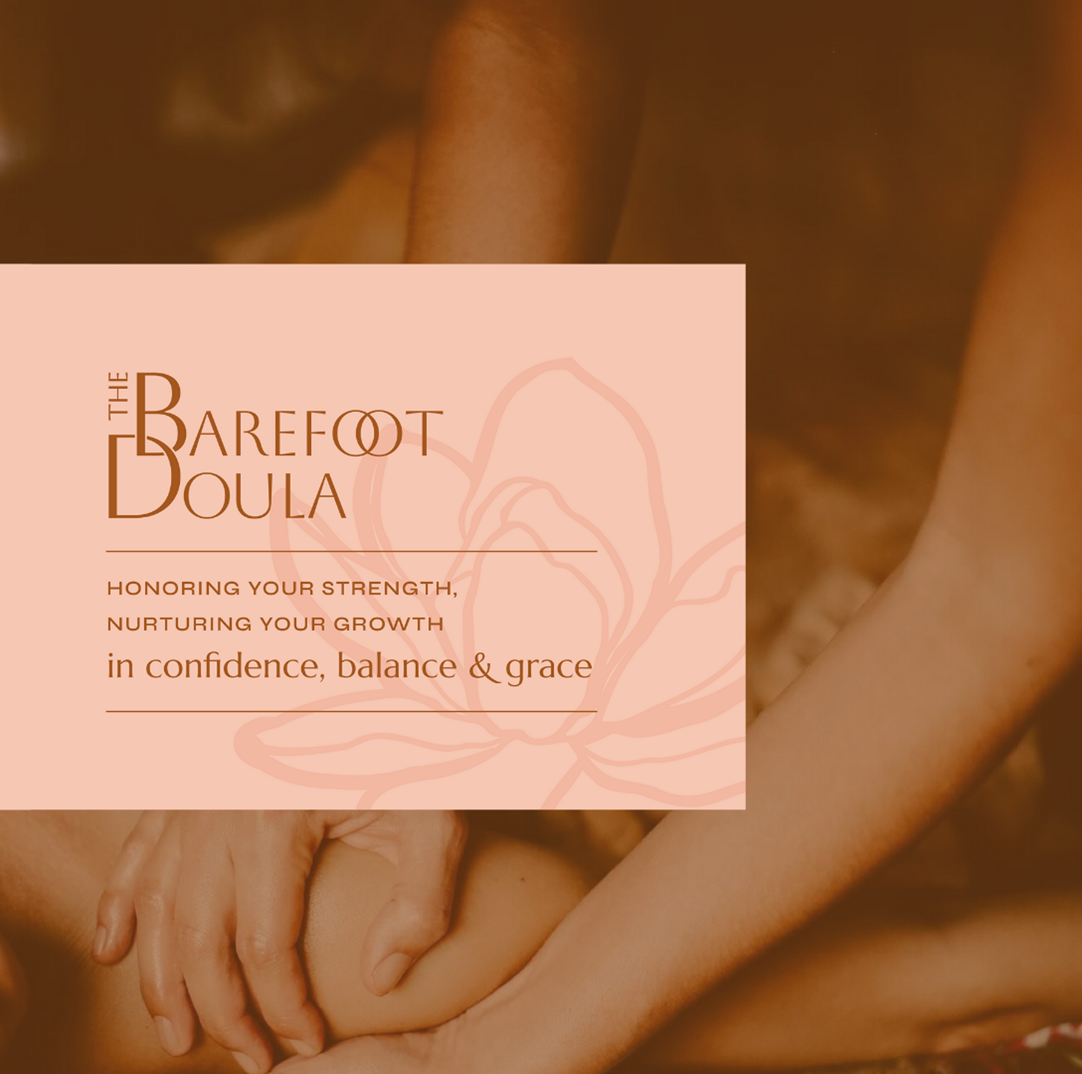
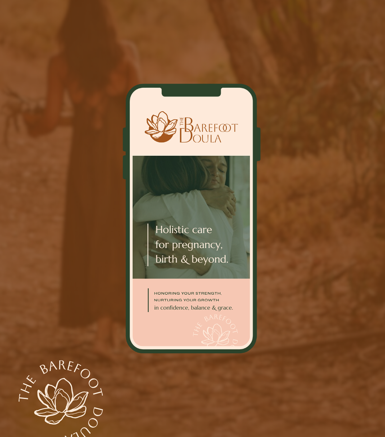
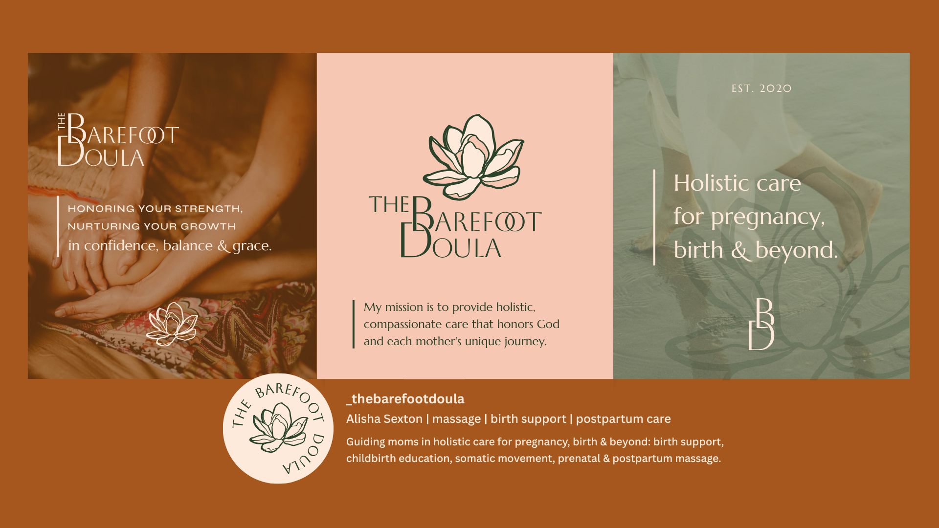
The Barefoot Doula needed a visual identity that reflected the grounded, holistic support she offers through pregnancy, birth, and postpartum care. Her work is deeply personal—rooted in compassion, faith, and trust—and the brand needed to feel steady, nurturing, and quietly confident.
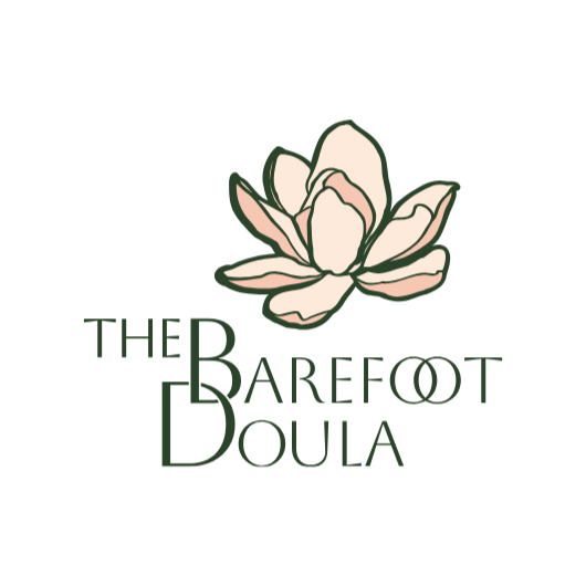
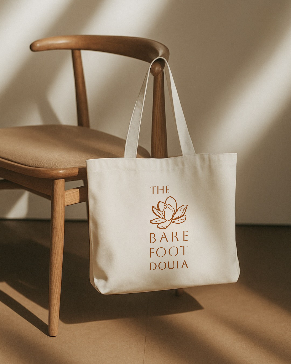
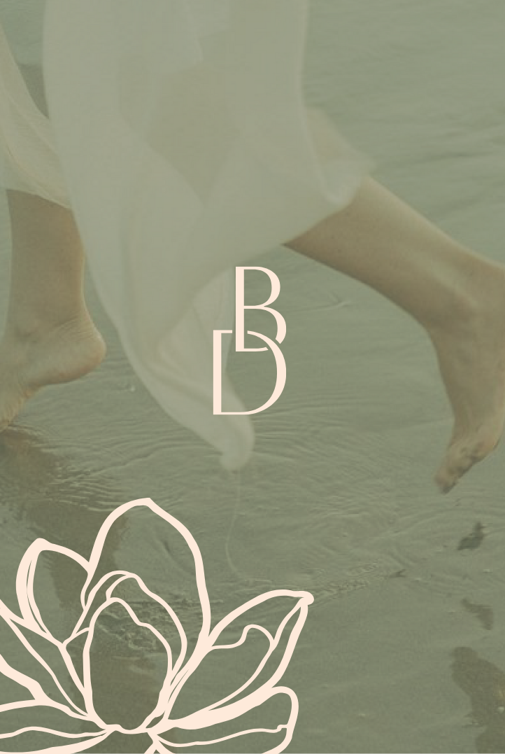
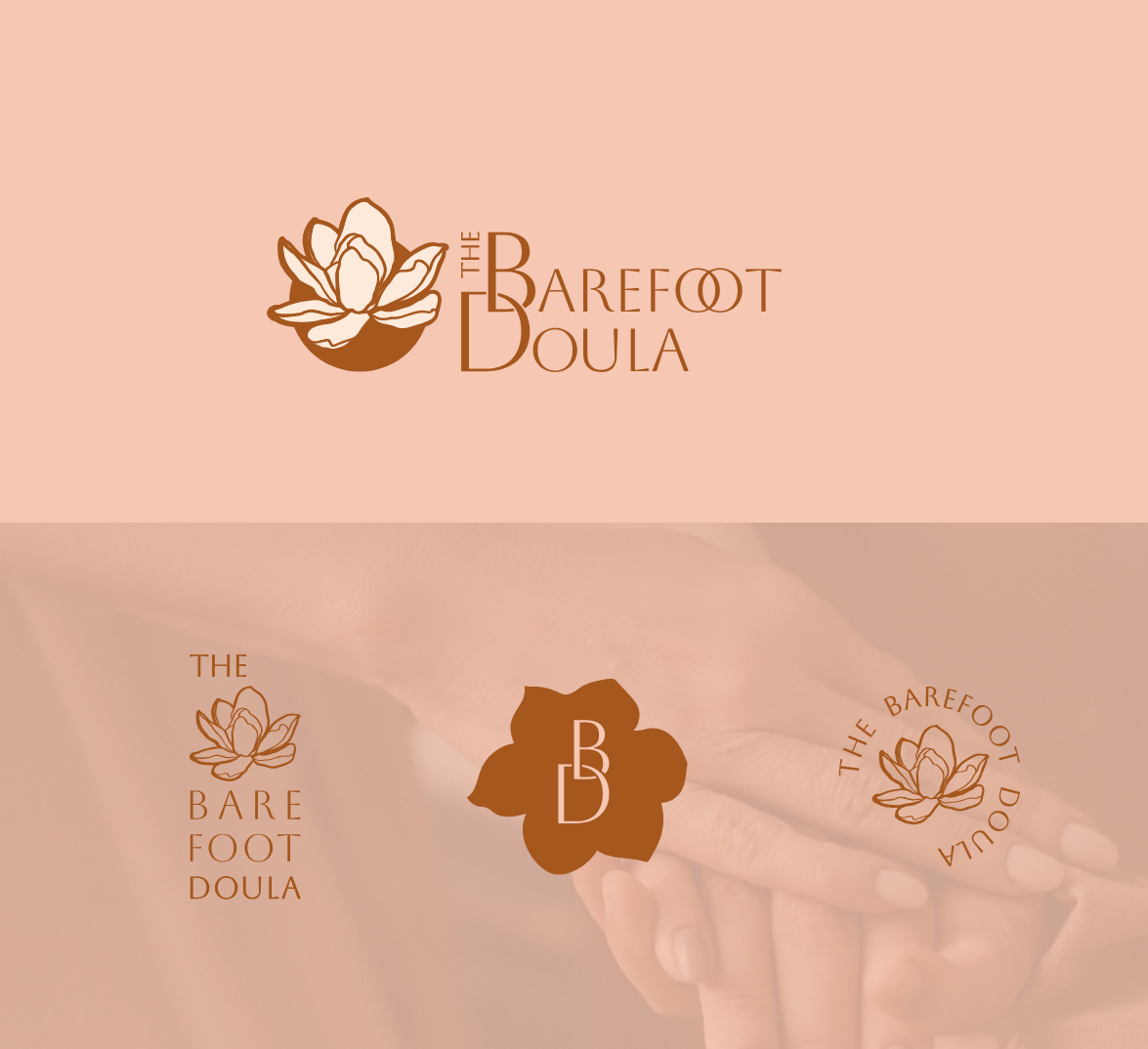
At the heart of the identity is the magnolia flower, chosen for its rich symbolism. One of the oldest flowering plants on Earth, the magnolia represents strength, endurance, and resilience—a reflection of the profound physical and emotional journey of motherhood. Though often perceived as soft and delicate, the magnolia is remarkably strong, blooming boldly and adapting through changing conditions. This balance of gentleness and strength mirrors the care The Barefoot Doula provides.
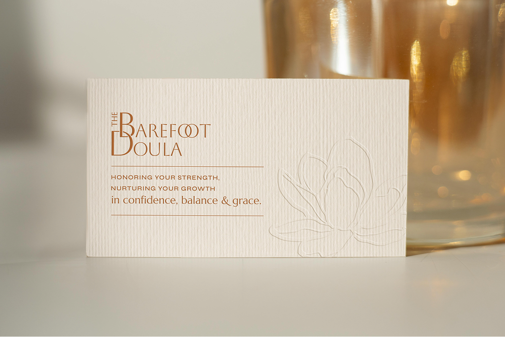
The client wanted her brand to communicate warmth, dignity, and grace while honoring each mother’s unique path. The color palette draws from earthy neutrals and soft tones, evoking calm presence, trust, and a sense of being held. The floral-inspired brand mark symbolizes growth, femininity, and quiet confidence, remaining legible and versatile across digital and print applications.
Every element of this brand works together to reflect what makes The Barefoot Doula special: holistic, faith-centered care that honors strength while nurturing growth. The final identity captures a grounded presence—one that invites mothers to feel supported, confident, and deeply seen throughout their journey.