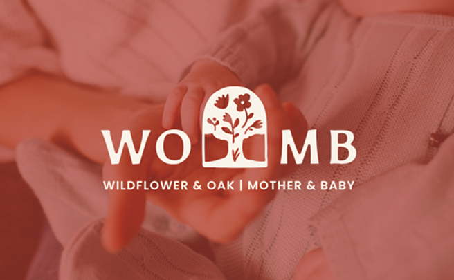
WOMB Doula Certification
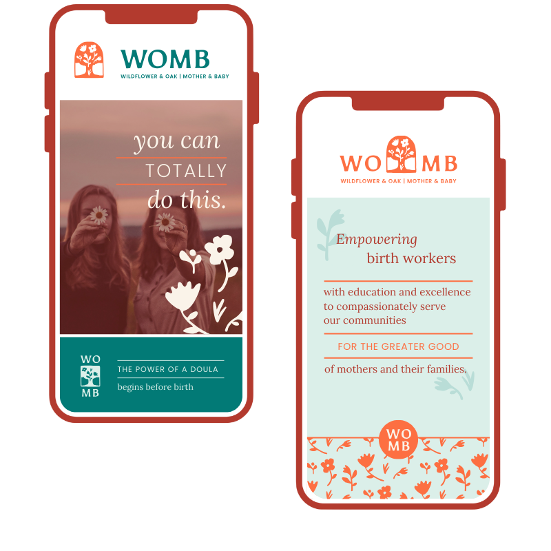
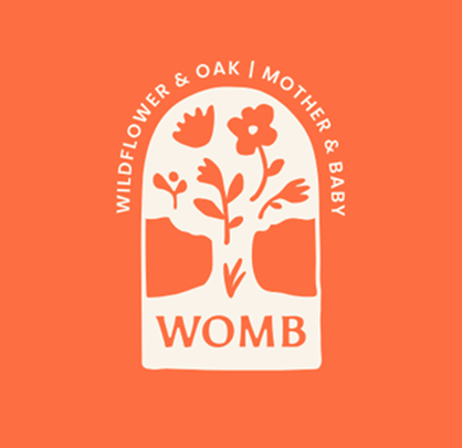
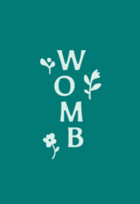
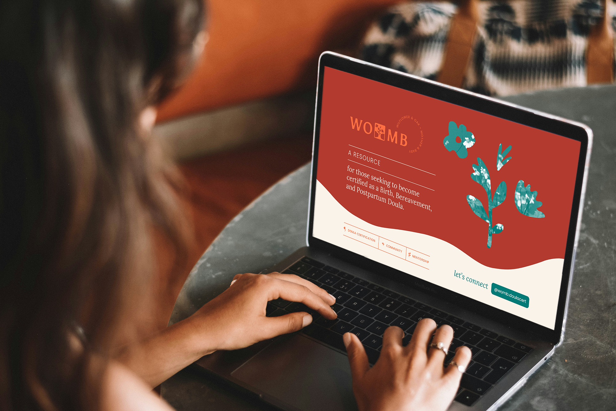
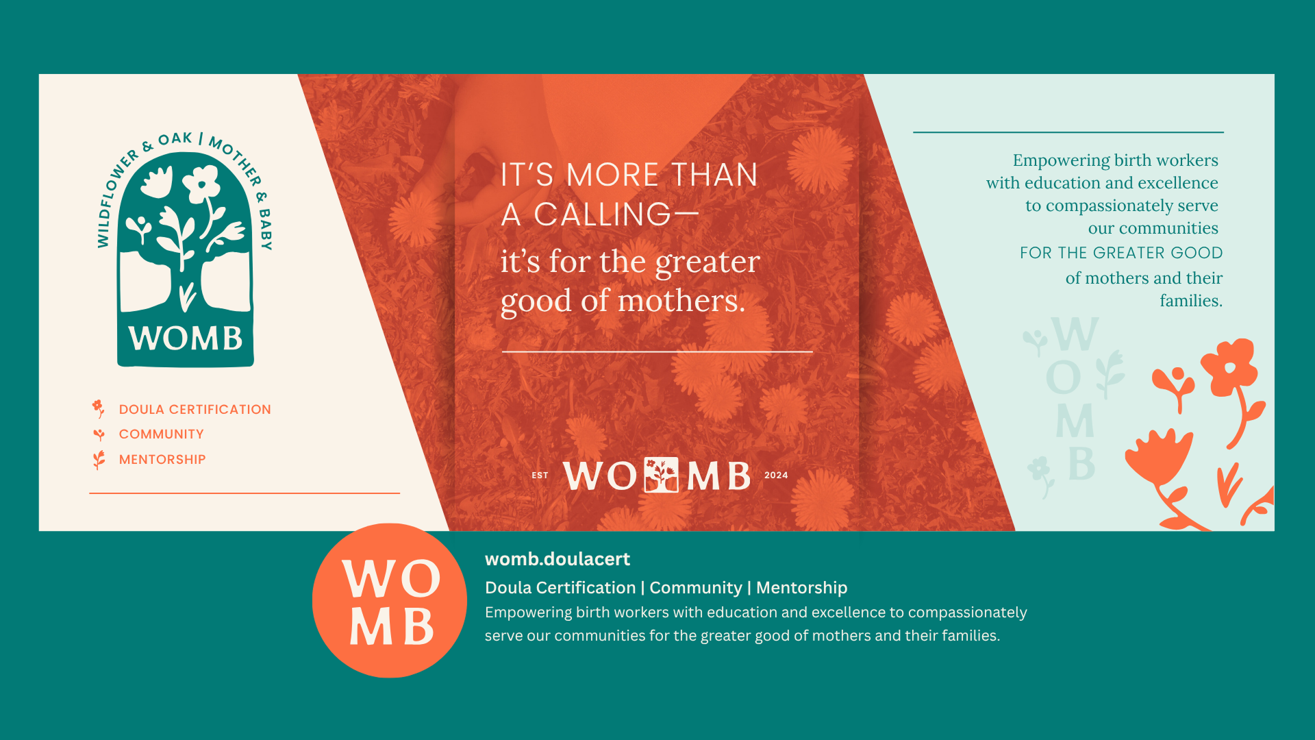
WOMB Doula Certification needed a visual identity that would represent the legacy work they were doing in cultivating and empowering a community of birth workers. We achieved this with a bold yet playful brand mark that captures the significant bible verses that root them in the heart of their mission. The full visual brand embodies their life-giving support with a color palette that feels vibrant and inviting.
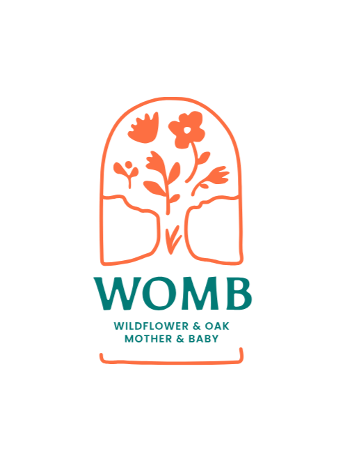
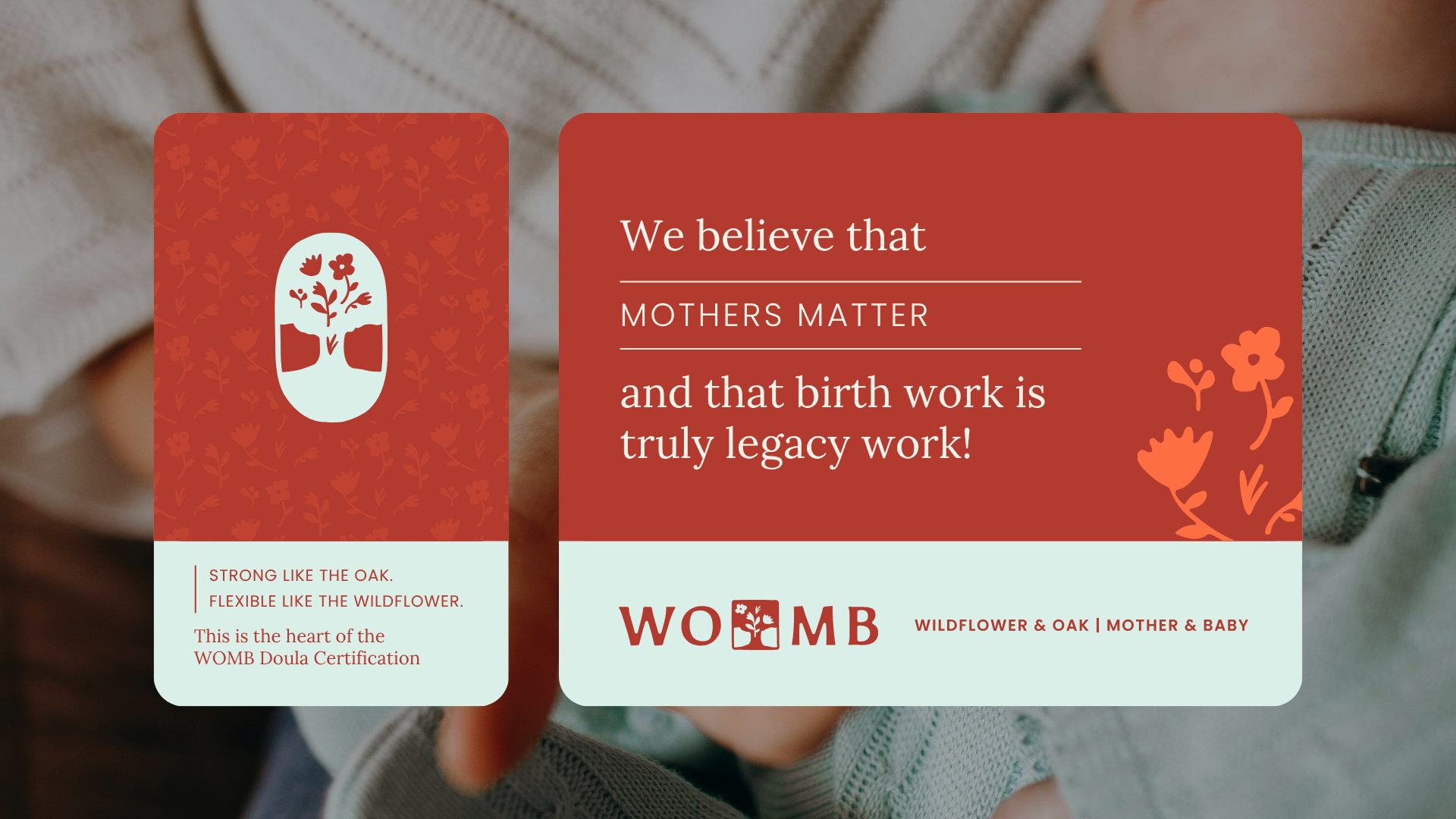
This client needed the brand to speak with compassion, wisdom and authenticity. They wanted to portray a bold confidence that felt approachable and warm. After many color explorations, we landed on this color palette that conveys earthy warmth and modern boldness.
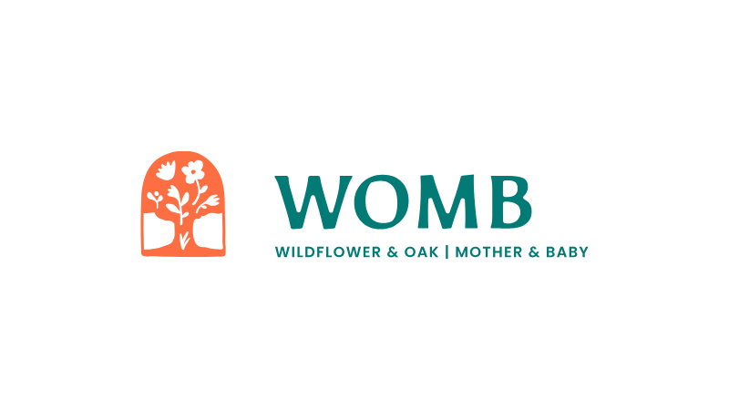
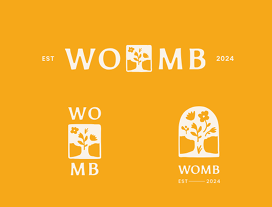
Working from the Brand Foundation, we crafted a distinct, one of a kind design that is unique and memorable. Our aim was to create a brand mark that evokes meaning and connects back to the deeper brand story. A full logo suite was developed for legibility and functionality across all brand applications.
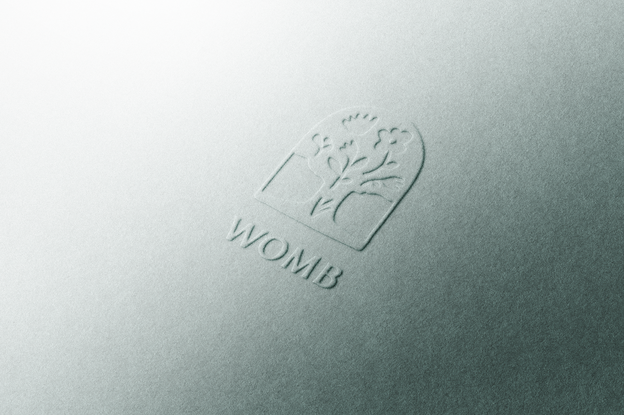
This visual brand captures exactly what makes WOMB special — every element works together to tell the story of a resource ready to empower birth workers to compassionately serve their communities.